Priority Bicycles lets riders choose their own adventure
Published on June 28, 2023
Collaboration (and Dropbox) helped this online-first bike retailer get their line of adventure bicyles in front of customers.
Priority Bicycles made an instant name for itself after releasing its maintenance-free leisure bike for casual riders in 2014. So why would the company—one of the OGs of online direct-to-consumer bicycle retail—open an adventure biking center in the Bay Area, 3,000 miles away from its home base?
It’s a question Connor Swegle, the co-founder and chief marketing officer of Priority Bicycles, asked himself a lot during the last four months.
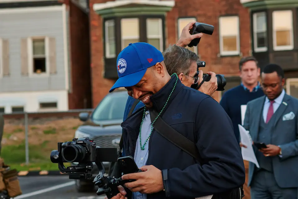
“Multiple times, I was like, ‘What are we doing? Who came up with this idea?’” he says, laughing, from Priority’s showroom in New York City. (The company’s operations are split between Tribeca and a 10,000 square-foot warehouse in Pennsylvania.)
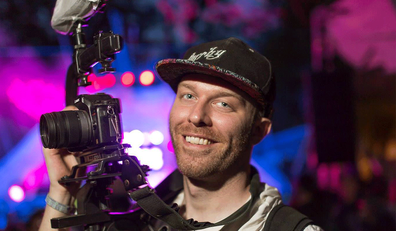
The opportunity to create an adventure line of bicycles—and to have folks experience and test them out in mountain biking’s birthplace—started with Priority’s customers and champions like filmmaker and adventurer Ryan Van Duzer. The company hears from hundreds of customers a day; they all loved their leisure bikes’ Gates Carbon Drive belt and internal gears, which eliminates rusty chains and the need for routine tune ups. But they also wanted that same low-maintenance experience for different types of biking.
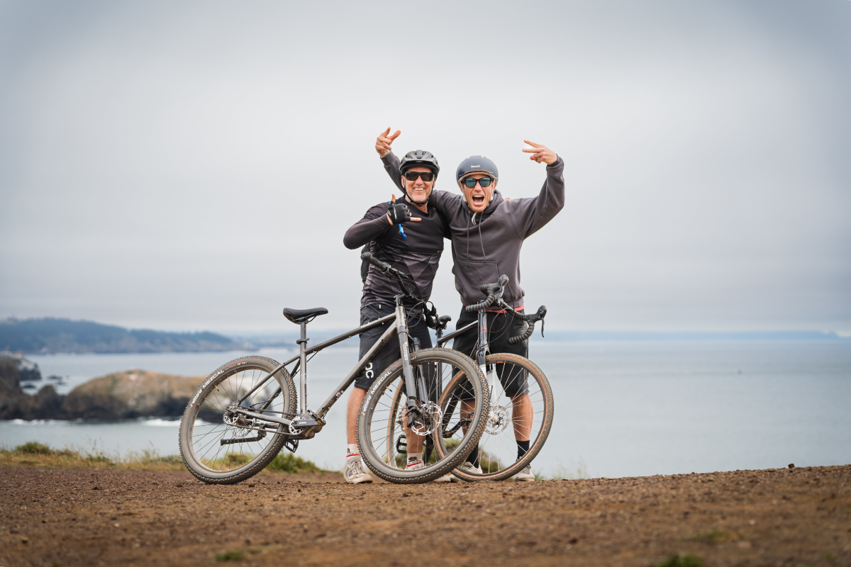
With requests coming in through its Dropbox-powered customer service portal, the company was eager to design the bikes their community wanted. Priority’s offerings grew as the community grew.
“We created beach bikes because beach cruisers get super rusty and slow,” Swegle explains. “Then we created commuting bikes because people were like, ‘I have 21 speeds, but they don’t all work.’”
Eventually an unexpected use case popped up: Those commuter bikes, originally meant for all-season everyday riding, were being used for long, intense excursions—some that even rivaled the distance of the Tour de France.
“So our team thought, ‘These bikes are really great for this everyday usage. How do we move it into that adventure world?’” Swegle recalls.
The feedback Priority got inspired the company to create a line of adventure bicycles that could be used on bumpy roads to slick city streets (really, wherever cyclists wanted to take them), and the April launch of the Priority Bicycles Adventure Center in San Francisco.
But like any cross-country journey, getting from point A to point B wasn’t easy. Swegle explains in his own words how the company, originally beloved by novice bikers, created a thriving adventure sub-brand.
Step one: Listen to feedback
Our product development comes from the feedback we get from our customers. Customers can upload their warranty or a video or photo of their issue directly to our Dropbox link, and we can make notes on it and reply. Being able to have tactical feedback that we can save, look back to, and hear the context of is something that’s really helpful. It helps us stay consumer centric, keeps us from getting lost in our own little echo chamber of development, and makes people feel like their specific problem is being seen or heard.
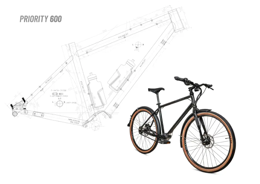
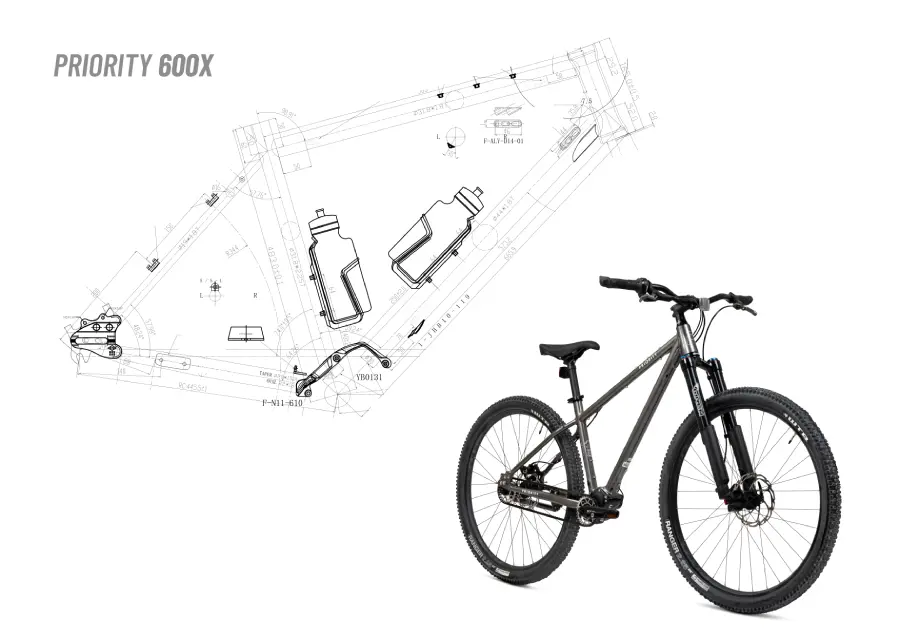
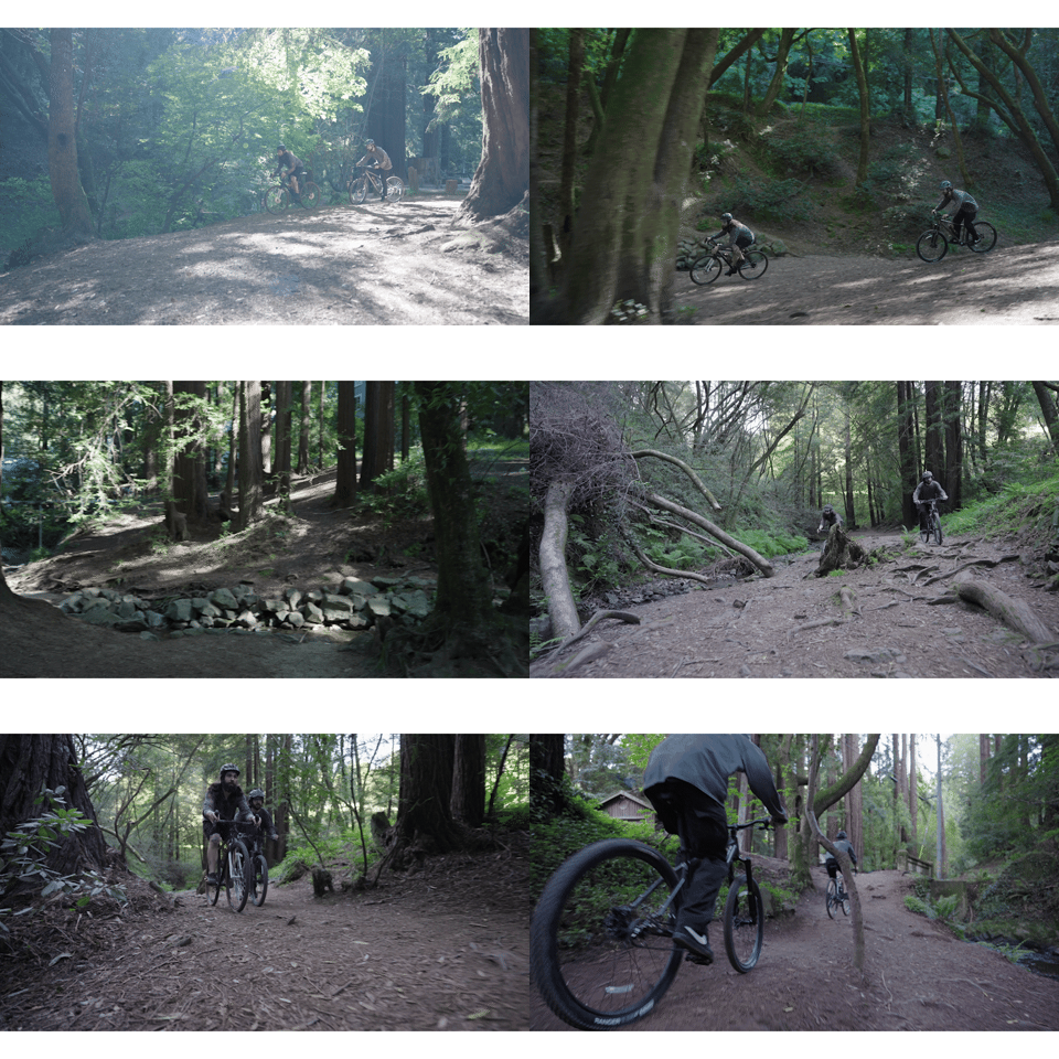
One of the pieces of feedback we got from customers is that they wanted something that was able to traverse more tactical ground. We created these bikes called the 600, which were made to ride on dirt trails, or ride in the street, or do both—kind of all-in-one. Our bikes are designed in New York, and we use Dropbox to work with our factories and product testers. We’re going back and forth with them all the time on different bikes.
Then they get shipped to our warehouse in Pennsylvania, and we do all of our fulfillment from there. We tested it in house using riders who are within our network, like our good friend Ryan Van Duzer. He’s a terrific athlete who rides a lot of bikes; we sent it to him so he can put it through his paces.
Duzer gave us specific feedback to modify the 600 so he could take it on one of the most challenging rides in the world, the Great Divide Mountain Bike Route in the Canadian Rockies. We were able to go back and forth, getting real-time notes, thoughts, and experiences. With his feedback and direction, we developed our first adventure-oriented bicycle: The 600X.
Step two: Have an audacious idea and the perfect partner
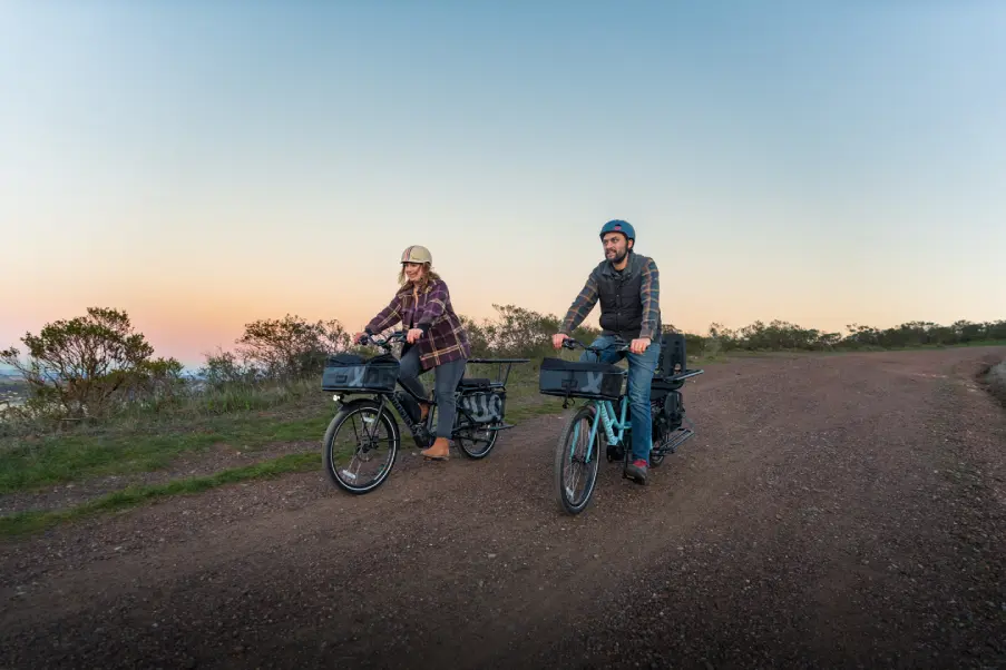
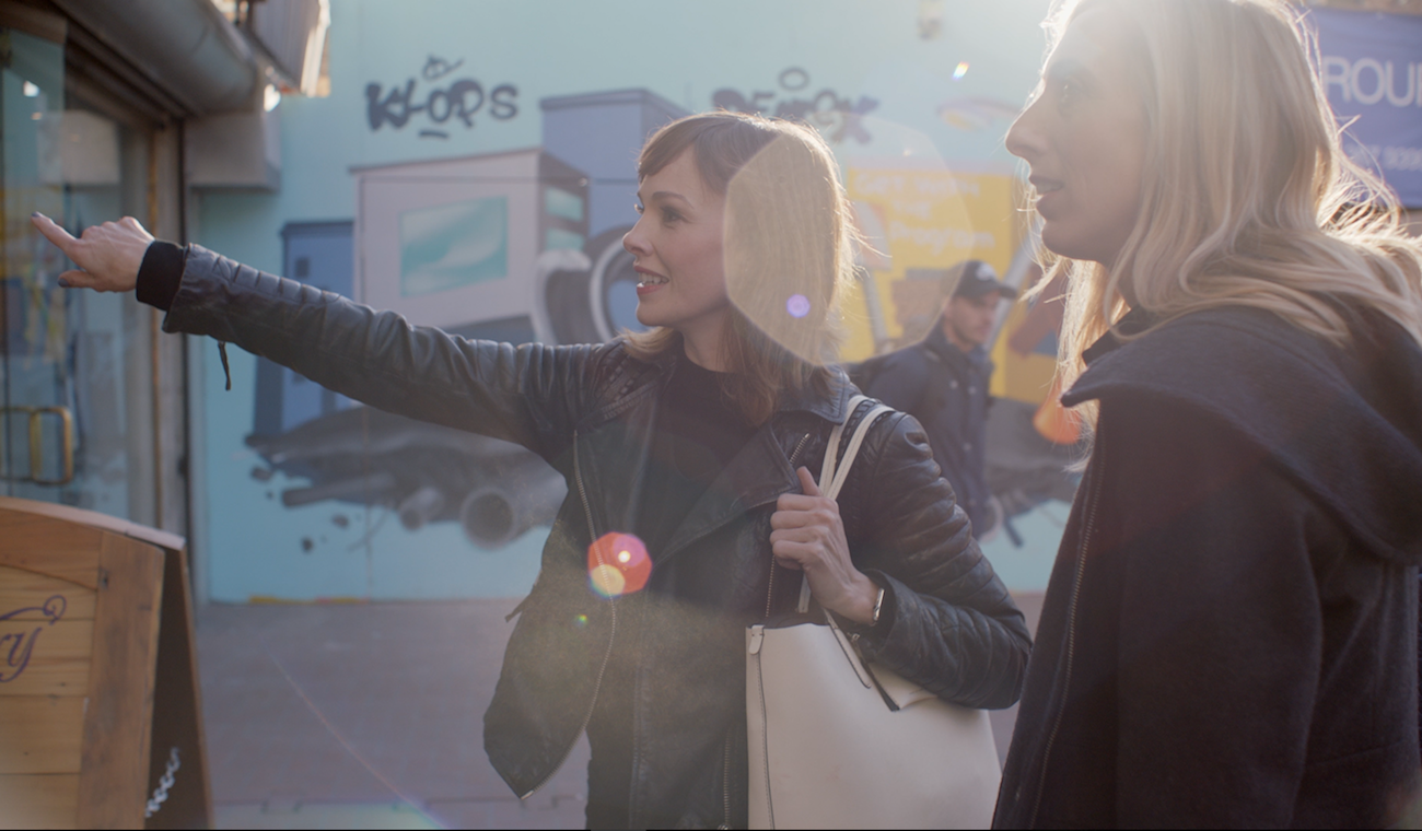
We were out in San Francisco for some meetings with Xtracycle, an innovative bicycle manufacturer based in Mill Valley. We were walking from our hotel to their store, and realized, “This is a really great area.” You can ride, like, four miles to Sausalito, six or seven to go over the Golden Gate Bridge; you can get out to the beach, you can get out to the mountains all from right there.
We sell our bikes online and we’re committed to that as a core part of our business model. But there are people who still want to be able to kick tires and see something. The fact that we have access to this cool center in this great, vibrant area where mountain biking was born? It would help us show people on the West Coast that we have some interesting things going on.
In creating experiences with other people, you want to make sure that you have shared values before you can even get to the creative and execution process. And this was just a location that’s focused on community, great customer service, and great customer experience. Those things are very important to us, so that laid the foundation for us to be able to move to things like designing this cobranded experience. Our product had a perfect fit in the area and the experience would be right. There was nothing that we were shoehorning. Xtracycle saw the opportunity too, so it was really just doing it and figuring out the logistics of getting it out there.
Step three: Build the space out from 3,000 miles away
There are challenges when you’re working with two different brands that are also 3,000+ miles apart. I think that communication gap is something that is really important to bridge quickly. You can try and do it with text and email, but I do think having the visual anchor—and the shared space to communicate about what the perceptions and executions are—is really important. Dropbox is how you bridge the gap.
In the initial development, we were using Dropbox to share and show “Hey, here’s what we’re working on. How does this work within the space?” The general manager is someone I’ve known for close to 20 years, so he was able to help with creating a shorthand. He’d say, “Great, I can make that work.” It also just made it easier when you’re stressed out about stuff—the fact that you can at least be laughing about it with someone.
Luckily we didn’t need to do a ground-up build; their store exists in a really cool area. But the space was filled with their cargo bikes. So the challenge was how do we fit six models of our adventure bikes there? It’s not a huge footprint, so we did have to design to capitalize on the space that we had. We also had to be able to support different products in the space so that people could try different things. If somebody comes there, they can’t say, “Hey, you only have a medium. I want to try a small.”
Typically it’s an open space, so we elevated our bicycles on one side of the space so people can get a sense that it was a different product and what the use case was at a glance.
Step four: Create a visually distinct sub-brand
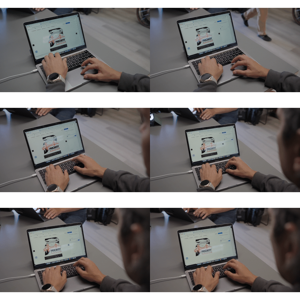
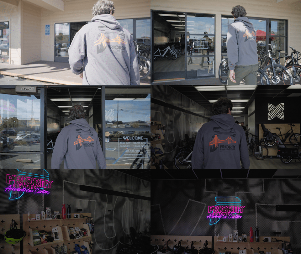
Talking about the branding in the space was a big part of it. This is Priority Bicycles, but this is a Priority Bicycles Adventure Center Experience in Xtracycle in the Bay Area. The graphics and iconography that live alongside that had to be very refined.
It was important for us to share the assets with our partners quickly. You go from one design logo asset to, 60, 70, 80 different executable assets just for this sub-brand. Having all those assets shared in a place where we can make sure that we are keeping the thread of the brand tight was really important. We could show what the North Star was and the guiding path for it all the way through.
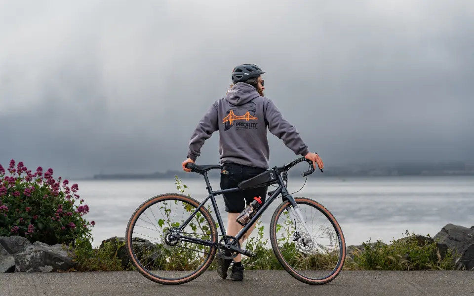
The idea of adventure gave us this really interesting way to modify our logo and apply it to the experience. Where the Adventure Center was, and what you could do there, were things that we wanted to pull forward in the logo. We had some different iterations, but landed on our Priority “P” with the Golden Gate Bridge cutting through it.
Being able to capture that sense of exploration and freedom in the logo…that’s what happens with bikes. That’s something that we all got when we were kids hopping on a bike: It’s your first sense of freedom. And I think that’s why people continue to love bikes, no matter what age or stage they’re at.
Step five: Share it with the world
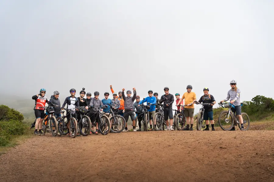
You’ve got to tell big, big stories in big ways for people. When we launched the Adventure Center, we ended up having five events over a two-day period. We had a media meet up day where we met with some different content influencers. We had an open house. Then there was a group ride, a speaking event. And the next day, we had a family day and a demo sale.
There was a lot of nervousness, but our family and friends were there and I think we delivered on what we wanted: That sense of positivity, community, and fun.

.jpg/_jcr_content/renditions/SH-06003_R%20(1).webp)

.png/_jcr_content/renditions/hero_square%20(2).webp)




.jpg/_jcr_content/renditions/1200x628%20(5).webp)
